Break-down onboarding secrets with Blinkit
To truly solidify your learning, you need to put it into action. We believe in applying what you learn right away—creating work that can be implemented next Monday. It’s through this hands-on approach that concepts go beyond theory and turn into real, impactful outcomes.
Now, let’s dive into the project.
How many times have you found yourself in a position where you’re too tired (read: lazy) to go for grocery shopping after a long, tiring Monday? 😴
Or, you have your friends over and there’s that 1 person, who wants to have coke (just..coke 🤐).
Kirana stores are a boring place to spend your Saturdays, and waiting for slots is just too much of your effort.
Now what if, you get all your essentials- from veggies to cigarettes or milk to mixers-
All from 1 app, within 10 minutes! 😍
Introducing, Blinkit. 😎
👥 Ideal Customer Profile:
🙋🏼♀️ Meet Richa - ICP 1
- Richa is a 21 year old, Economics student at Delhi University, living with her friends in a pg. She is interested in marketing & actively applies for relevant jobs (the likes of Marketing Associate, Brand Solutions Associate) on Linkedin.
- She uses social media platforms like Instagram & Snapchat, orders from Myntra & H&M and pays either via cash or Paytm.
- She commutes via metro or autos and spends close to INR 2,000/month on travel.
- She likes spending her time by watching shows on Netflix & Amazon prime, or goes to cafes with her friends.
- Saving money is always a priority for her, so she actively looks for discounts while ordering from Zomato, or taking an uber auto.
Problem Statement for Richa:
- Richa frequently needs to get fruits, milk & snacks and generally at different times. She wants to munch something in the night, or needs milk for her early morning exam, and has no time to step out.
- She can conveniently order her essentials at a discounted price and save extra 50 bucks in a single order. (Yay, that’s like a metro ride fare to Connaught Place😛) The order gets delivered within 10-minutes, saving her time.
JTBD for Richa:
- Functional Goal- Richa gets all necessities & munchies home delivered conveniently, without stepping out of her PG (more convenience when PG’s deadline is over or she can not step out).
- Financial Goal- Richa is able to get discounts on everyday products and saves her pocket money/stipend.
- Social Goal- Richa brags about Blinkit to a friend studying in Punjab university (where blinkit is not currently present).
🙋🏼♂️ Meet Kabir - ICP 2
- Kabir is a working professional, working as a Management Consultant at ZS and resides in an apartment in Gurgaon with his partner.
- He uses Twitter, Instagram & Linkedin, orders from Cred or Myntra and uses his credit card or UPI apps like Google-pay for his transactions.
- He commutes via his own car or takes an Uber and spends close to INR 5-6,000 monthly on travel.
- He likes spending his time by learning new things inside & outside his scope of work, going to the gym and hanging out with his friends.
- Kabir prioritises convenience & time over discounts, and does not mind paying premium to get a good service.
Problem Statement for Kabir:
- Kabir is stuck in his office till 8:30 pm, right when his cook is about to reach and he realises he needs to stock up his fridge with vegetables.
- Or, he has hosted a party and fell short of mixers and only realised when it’s too late to drive.
- Kabir can get all his essentials delivered in under 10 mins via blinkit, without any hassle or effort.
JTBD for Kabir:
- Functional Goal- Kabir is able to get all his groceries, vegetables & essentials delivered quickly & conveniently and does not have to to specially go shopping after his long tiring office hours.
- Financial Goal- Discounts are like a cherry on the cake for Kabir, he’s happy to save some money from everyday transactions.
- Social Goal- Kabir frequently hosts parties in his apartment and boasts about getting chips & mixers delivered in minutes, without having to step out.
👥 ICP Overview:

🔎 JTBD Overview:

✅ Let’s start the Onboarding Teardown
1. Discovery
🔎 Google Search:
Keyword: Order grocery online


1- ❌ Blinkit not ranking #1 for the keyword- order grocery online. The ad copy can also be improved. No value prop (around Delivery time or discounts) is mentioned. For someone who does not scroll beyond the 1st link, Blinkit will not be discovered. (Default Bias)
2- ❌ Keyword “grocery 10 min” is not targeted for and it’s a huge opportunity loss for blinkit.
3- ❌ For the keyword blinkit, again, the 1st ad has no value propositions in the headline.
4- ❌ The description in the organic result is also not user centric, sounds like business info.
✅ What could have been better?
- Better ad text, inclusion of keywords in text to help rank in the 1st or 2nd result.

(Keyword can be anything from brand/ use case/ competition)
Cognitive Bias at Play
- Anchoring Bias
- Default Bias
💸 Facebook Ads

✅ All these beautiful ads makes the product’s JTBD validated.
Design & copy focuses on the core offerings of the product: “Get everything in a blink” // Finding pet products to stationary to fruits - convenience
A meme, turned ad- you already have your Genz/Millenial’s TG money 🤑
Cognitive Bias at Play
- Aesthetic (static designs)
📱 App Store:


1- ❌ Blinkit comes on 4th listing & the 3rd organic listing.
Although, once the user scrolls and sees the listing, the core value props are highlighted via the images.
2- ✅ Even if the user sees Zomato while searching for blinkit (duh), the use case for both the products is different and again, the core value prop is highlighted via the images.
✅ What could have been better:
- The name could have included keywords like “Grocery Delivery/10-min delivery” to help it rank organically.
- Sponsored search can also be leveraged.
Cognitive Bias at Play
- Anchoring Bias (User might just click on the 1st option as a default setting)
- Default Bias
App Store Reviews


✅ There are 1.25 Lakh ratings with 4.5 being the maximum, which builds the social proof. The first rating co-relates with the value prop of the product too.
❌ But as we scroll and read, it’s filled with bad reviews which will help the user form an opinion before even checking out the product.
Cognitive Bias at Play
- Social Proof
- Confirmation Bias


✅ The 1st 3 lines narrate a story which is very relatable for most of the users.
❌ I do not see the core value prop (Delivery in minutes/convenience) until the 3rd paragraph.
✅ What could have been better
- Starting with a story but keeping “delivery in minutes/ convenience” as a JTBD by the product in the starting, to reassure the user.
Cognitive Bias at Play
- Anchoring Bias
- Storytelling Effect
2. App Touchpoints
- Opening the App


1,2 & 3- ❌ ❌ ❌
The moment user opens the app, they are bombarded with access permissions. They have not even checked out 1 single feature
✅ What could have been better:
- Location access could have been asked once the user is inside the app- to communicate the delivery time/experience to me. (Web version does that):

- Other access permissions can be asked once the user has spent (x) minutes in a single session (Can be decided by mapping the user journey)
Cognitive Bias at Play
- Cognitive Load
- First screen after the permissions

✅ Core Value Prop - Grocery Delivery in minutes communicated on the 1st screen
✅ The visuals/designs are pleasing
✅ It gives the user an option to Skip login and explore without any “sign-up commitment”. They only log-in when they have to place an order.
Cognitive Bias at Play
- Cognitive load (lesser- owing to the Skip login button)
- Aesthetic-Usability Effect
- Picture Superiority
- Signing up/ Logging in
✅ No Account creation, no google sync, no email confirmation! Get’s the user inside the app in >10 seconds.
Cognitive Bias at Play
- Cognitive Load (no fuss in creating the account)
- First screen in the app


✅ Mini- AHA moment, showcases discount as the 1st touchpoint (same thing was communicated on the app-store as well) & 11-min delivery as the 2nd touchpoint.
❌ Although, as Delivery Time is the CPV, it should be the main focus whenever the user opens the app.
✅ What could have been better:
- Main focus on the CVP- delivery time (Refer: Zepto)

Cognitive Bias at Play:
- Anchoring Bias

✅ User gets to explore the category images**,** which are real product images and the UI is the same that the us`er saw in the app-store images
❌ Are all category images supposed to be on the 1st screen? Especially when there’s a category page.
✅ What could have been better:
- Only the top 8-12 categories can be showcased to make it easy for the user to select the relevant ones.
- This happens once 1 the user makes the 1st transaction- but can be done initially as well.
Cognitive Bias at Play:
- Skeuomorphism
- Hick’s Law (too much to choose from

✅ The search suggests products from different categories to help the user get their Job done.
- Placing the first order
(A) Selecting products & adding to cart


1,3- ✅ Allows the user to select products categorically, making it easy for the user
2- ❌ The banner at the top redirects to a page with 1 single SKU- poor aesthetics
✅ What could have been better:
- A cover banner re-iterating the communication “Delivery in Minutes” would have been a good communication play.
Cognitive Bias at Play:
- Hick’s Law (Lesser options on a categorical level given on a page)
- Aesthetics (can be better)
(B) Cart and Checkout page


1- ✅ Helps the user get their job done “in 12-minutes” - reassuring the CVP
2- ✅ Pushes the user to shop for just Rs 5 more to avail free delivery (but actually, the product amount will be more than Rs. 5 or 15, in most of the cases)
3- ✅ The user got themselves the Free Delivery, making them feel good about using the product
Cognitive Bias at Play:
- Nudge Subtle hints (suggesting to make the extra Rs.5 purchase)
- Spark Effect (adding a lower priced product in cart)
- Endowment Effect (getting themselves the free delivery)
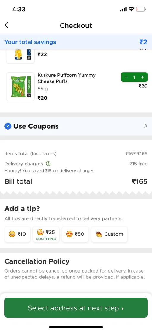
(C) Placing the order

✅ Showcases the tipping option only once the user is ready to place the final order.
Cognitive Bias at Play:
- Cognitive Load (Less)
- Centre-Stage Effect (Most tipped)


1- ✅ Giving user tasks- 1 step at a time ~ Select address at next step
2- ✅ Once address is added, only then payment method is asked to be added
❌ There’s nothing that tells the user the numbers of steps left. Is the user supposed to put their email or any other detail here?
✅ What could have been better:
- A progress bar showcasing that completing the order is just a 2-step process.
Cognitive Bias at Play:
- Progressive Disclosure
(D) Post-order screens


1- ✅ Another mini- AHA moment, order is successfully placed and will be delivered in 12 minutes- reassuring again
1- ❌ There’s no discount/blinkit coins being offered post the 1st successful order (as a new user, I have not used the discount code as well).
2- ❌ AHA-moment dropping, order shows a slight delay due to packing.
3- ❌ AHA-moment dropping even further, order is packed but rider has not been assigned.
The time **still shows 10 mins** (it’s been over 5 mins when it showed 12 mins)
✅ What could have been better:
- A discount/ blinkit coins/ Free Delivery could be offered to the new user after their 1st transaction. That will keep the user incentivised/motivated to come back
- Correct time estimates to be promised to make the user feel consistency throughout the journey.
Cognitive Bias at Play:
- Variable Reward (if discount would be offered)


1- ✅ Immediately, the order is back on track and the time delivery seems to be on time
2- ✅ Hygiene & safety validation and support access makes the user feel safe & happy about the transaction/order.
Cognitive Bias at Play:
- Nudge Subtle hints (making the assure feel good about the experience)
(E) Order delivery completion

Yup, legit asked the guy to let me click a picture for this assignment.
✅ Order reached to my doorstep in 12 mins 43 seconds- AHA moment. Even after some downhill experience, the time commitment was fulfilled.
✅ My product (milk) came in an ice box, delivering the product fresh & perfect to use - AHA moment.


1- ❌ Time mentioned is wrong, they were able to deliver in the promised time but communication logic is flawed.
If a user does not have a stop watch running (which they won’t in most of the cases), this damages own reputation of making the user believe that the job was done but delayed.
2- ❌ Post final delivery screen as well, there is neither any rating option for the order, nor any discount/incentive being offered to the user.
Cognitive Bias at Play:
- Anchoring Bias (user will only see the 14-min update)
- Variable Reward (user would enjoy if there were something post final delivery)
🤑 Activation Metrics
1- Hypothesis 1: 2 successful orders/week in the first 2 weeks
➡️ Reason: A frequency of 2 in a week means the user is coming back to the product after exploring the AHA moment to avail the CVP (Delivery in minutes)
2- Hypothesis 2: 7-8 successful orders in the 1st month
➡️ Reason: This validates that the user is coming back again actively to use Blinkit for the job they hired it for. (Early signs of retention maybe?)
3- Hypothesis 3: Tipping at least 2 times or more in a month
➡️ Reason: Shows monetary commitment & willingness to pay extra for good services
4- Hypothesis 4: Leaving a 4 star+ ratings on the app store
➡️ Reason: A user who is making an additional effort to rate the product & service and vouching for it (with their own reputation), should be satisfied with the product.
5- Hypothesis 5: Availing credit card discounts on their orders
➡️ Reason: The minimum bill condition for these offers is higher than AOV of a single user. Usage of discount shows financial commitment from the user, since they’re willing to transact for a higher amount
(Basis my user calls, the estimated AOV ranges from 250-300 INR, while these offers are on bill conditions of 500 INR & above)
📉 Metrics to Track
- D1, D7, D14, D30- Play store/ App store app views
- D1, D7, D14, D30- App downloads (to understand the drop offs)
- DAU/ MAU
- D1, D7, D30 transactions (to be compared with downloads)
- Payment page drop offs
- Repeat order ratio/percentage
~~
Fin. Thanks 🙋🏼♂️
Brand focused courses
Great brands aren't built on clicks. They're built on trust. Craft narratives that resonate, campaigns that stand out, and brands that last.


All courses
Master every lever of growth — from acquisition to retention, data to events. Pick a course, go deep, and apply it to your business right away.


Explore courses by GrowthX
Built by Leaders From Amazon, CRED, Zepto, Hindustan Unilever, Flipkart, paytm & more
Course
Advanced Growth Strategy
Core principles to distribution, user onboarding, retention & monetisation.
58 modules
21 hours
Course
Go to Market
Learn to implement lean, balanced & all out GTM strategies while getting stakeholder buy-in.
17 modules
1 hour
Course
Brand Led Growth
Design your brand wedge & implement it across every customer touchpoint.
15 modules
2 hours
Course
Event Led Growth
Design an end to end strategy to create events that drive revenue growth.
48 modules
1 hour
Course
Growth Model Design
Learn how to break down your North Star metric into actionable input levers and prioritise them.
9 modules
1 hour
Course
Building Growth Teams
Learn how to design your team blueprint, attract, hire & retain great talent
24 modules
1 hour
Course
Data Led Growth
Learn the science of RCA & experimentation design to drive real revenue impact.
12 modules
2 hours
Course
Email marketing
Learn how to set up email as a channel and build the 0 → 1 strategy for email marketing
12 modules
1 hour
Course
Partnership Led Growth
Design product integrations & channel partnerships to drive revenue impact.
27 modules
1 hour
Course
Tech for Growth
Learn to ship better products with engineering & take informed trade-offs.
14 modules
2 hours
Crack a new job or a promotion with ELEVATE
Designed for mid-senior & leadership roles across growth, product, marketing, strategy & business


Learning Resources
Browse 500+ case studies, articles & resources the learning resources that you won't find on the internet.

Patience—you’re about to be impressed.